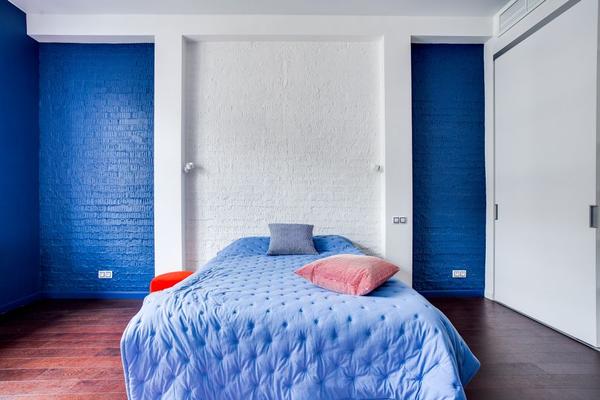

A calming bedroom colour scheme is less about following a trend and more about creating a room that feels settled the moment you enter. Paint alone cannot guarantee better sleep, but a carefully chosen palette can support a more restful atmosphere and make it easier to move from a busy day into a quieter evening routine.
Soft blues, dusty greens and warm neutrals are especially useful because they bring airiness, nature and comfort without making the space feel cold or bland. The key is to choose muted undertones and repeat them thoughtfully across walls, textiles, furniture and lighting.
What Makes a Bedroom Colour Scheme Feel Calming?
Calming interiors usually rely on low-saturation colours rather than bright, energising tones. Muted shades contain grey, brown or softened undertones, making them easier on the eye. Instead of producing sharp visual stops, they allow the room to flow.
Contrast matters too. Brilliant white walls, black furniture and vivid accessories can look stylish, but the strong differences may feel visually busy. Restful bedroom colours tend to sit closer together in depth and temperature. Think warm cream with oatmeal, pale blue with misty grey, or dusty green with soft stone.
Soft Blue for an Airy, Uncluttered Bedroom
A soft blue bedroom can feel fresh and peaceful without becoming chilly, provided the undertone is right. Look for blue-grey, powder blue, muted duck egg or pale denim rather than a crisp, icy blue. These softened versions work particularly well in rooms with natural daylight because the colour changes subtly from morning to evening.
Pair soft blue walls with warm white rather than pure white. Add oatmeal curtains, a beige upholstered headboard and light oak furniture to introduce warmth. A few deeper blue accents can provide definition, but keep them to smaller details such as cushions, a throw or a bedside lamp.
How to Stop Soft Blue Feeling Cold
Temperature comes from the whole room, not the wall colour alone. Warm bulbs, creamy bedding and natural wood can make blue feel comfortable and grounded. Brass, antique gold or bronze details also work well because their warmth gently contrasts with blue.
Dusty Green for a Nature-Inspired Retreat
A dusty green bedroom brings the quiet character of the outdoors inside. Sage, eucalyptus, olive-grey and muted moss tones are versatile because they sit comfortably between cool and warm. They can feel restorative and sophisticated at the same time, suiting both traditional and contemporary rooms.
Dusty green pairs naturally with warm neutral bedroom shades such as sand, taupe, mushroom and soft cream. Use green as the main wall colour, then add off-white bedding and medium-toned wood. Alternatively, keep the walls neutral and introduce green through an upholstered bed, curtains or a textured bedspread.
Avoid using too many different greens. Choose one dominant shade and one lighter or darker variation. This keeps the scheme intentional and prevents the room from feeling overly themed.
Warm Neutrals for Softness and Flexibility
A warm neutral bedroom is an excellent choice when you want calmness with long-term flexibility. Unlike cool grey, shades such as ivory, putty, oatmeal, biscuit and pale clay have subtle warmth that makes a bedroom feel welcoming. They also provide a quiet backdrop for changing bedding and accessories through the seasons.
The secret to a successful neutral room is layering. If every surface is exactly the same beige, the result can feel unfinished. Combine related tones: creamy walls, a taupe headboard, oatmeal curtains and a deeper brown throw. Introduce texture through boucle, brushed cotton, linen and woven baskets so the palette has depth without needing bold colour.
Test Undertones Before Committing
View paint samples beside the flooring, furniture and curtains. A neutral that looks warm in a shop may appear pink, yellow or grey in your bedroom. Test it on more than one wall and check it during the morning, afternoon and evening, as lighting can change its character significantly.
How to Combine Blue, Green and Neutral Tones
You do not have to choose only one colour family. A calming bedroom colour scheme can combine all three when one shade leads and the others support it. For example, use warm neutral walls, a dusty green headboard and soft blue bedding. Because the colours are muted, they can sit together without competing.
Repeat each colour in two or three places to make the room feel cohesive. A blue cushion might connect with artwork, while green piping on the curtains can echo the headboard. These small repetitions make the design appear considered rather than accidental.
Lighting and Finishing Details Matter
Even the most restful bedroom colours can look wrong under unsuitable lighting. Very bright, cool-toned bulbs may make muted shades appear stark. Warm white lighting generally creates a softer evening mood, while layered lighting gives you more control than a single ceiling fixture.
Use bedside lamps for reading and a dimmable central light for general use. Fabric, paper or frosted-glass shades diffuse light more gently than exposed bulbs. Keep accessories edited as well. A calm room does not need to be empty, but crowded surfaces and too many competing patterns can undermine the palette.
Common Colour Scheme Mistakes to Avoid
Do not select paint from a small digital image and apply it across the room without testing it. Always use sample patches, as orientation and shadow can affect the final result. Also, remember that not every pale shade feels calming. Some whites are extremely cool, while certain pastels can look surprisingly bright in strong daylight.
Finally, consider fixed elements. Flooring, wardrobes and large furniture pieces form part of the scheme. A beautiful dusty blue may clash with orange-toned wood, while a warm neutral could complement it perfectly. Build the palette around what will remain in the room.
Frequently Asked Questions
What is the most calming colour for a bedroom?
There is no single colour that suits everyone, but muted blues, dusty greens and warm neutrals are popular because they create a soft, low-contrast atmosphere. Personal preference, natural light and existing furniture should guide the final choice.
Can I use dark colours in a calming bedroom?
Yes. Deep blue, olive or warm charcoal can feel cocooning, particularly in a room mainly used at night. Balance darker walls with soft textiles, warm lighting and lighter details so the space does not feel heavy.
How many colours should a bedroom scheme include?
Three related colours are usually enough: one dominant shade, one supporting tone and one accent. Add variety through texture and different depths rather than introducing many unrelated colours.
Create a Bedroom That Feels Quiet and Personal
The best calming bedroom colour scheme is one that feels comfortable to you and works with the room’s natural light. Soft blue can bring airiness, dusty green can introduce a connection to nature, and warm neutrals can create an inviting foundation. Used separately or layered together, these shades help shape a bedroom that feels visually quieter and easier to unwind in.
Start with samples, observe them at different times of day and build the room gradually. When colour, texture and lighting work together, the result is an attractive, practical and personal space designed for rest and everyday relaxation.